Inspectors
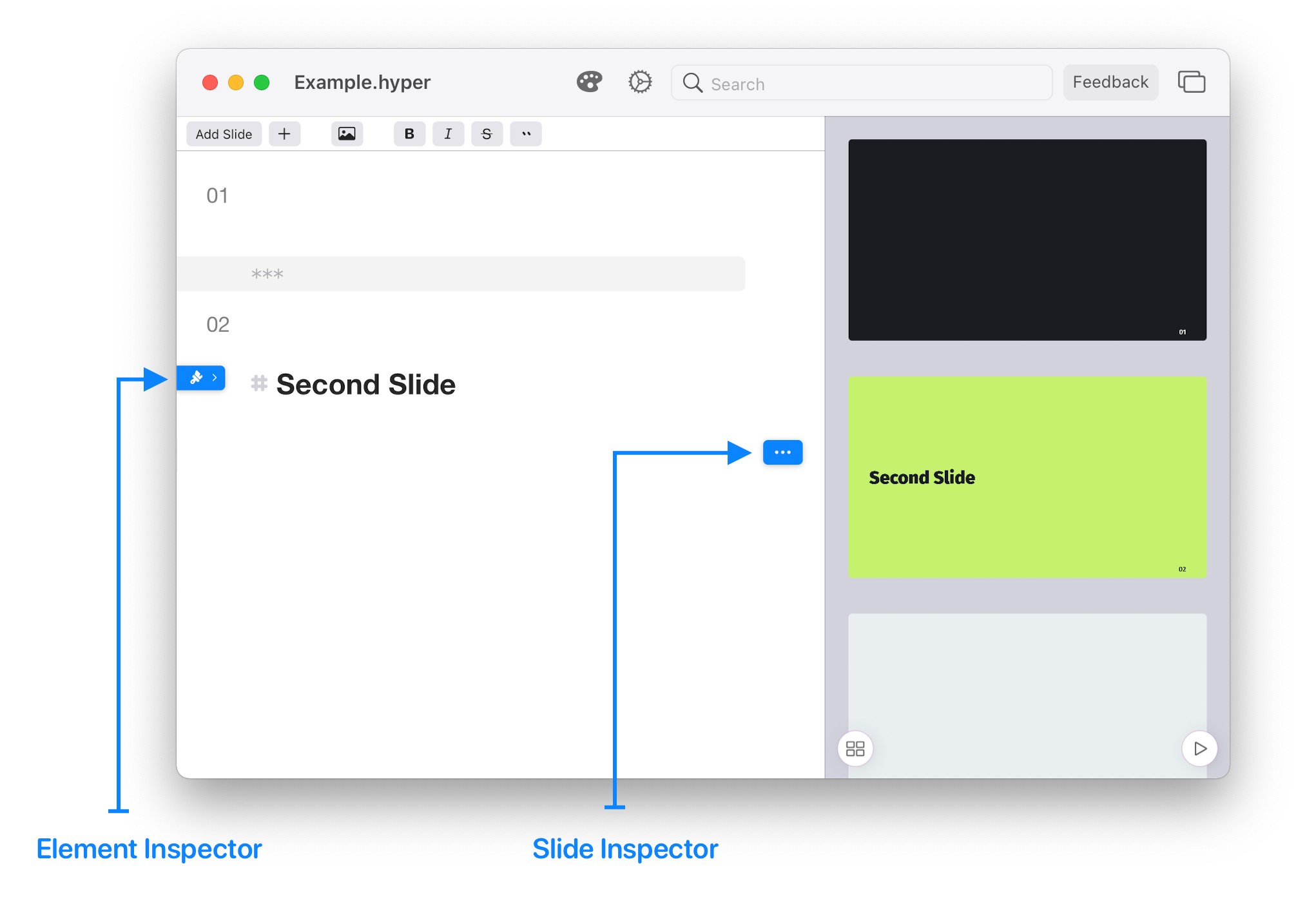
Hyperdeck allows you to modify your slides and elements via a comfortable UI, just like it PowerPoint or Keynote. For this, Hyperdeck includes so-called Inspectors which allow you to modify the attributes of all the elements in your presentation. Some Examples:
- Headline font size
- Slide Transitions
- Element Animations
- Slide Background Images
- Table Themes
- Source Code Colors
- and many more
You activate the Inspector for the current element or slide by tapping the paintbrush button in the top left.
Selected Element
The Element Inspector always shows the settings for the current element (Headline, Table, List, etc). Current means the element where the cursor is currently located in the Editor. You can also tap an element in the Preview in order to select / move the cursor there.
The next chapters will showcase the properties that can be set on the individual element types.
General Inspectors Attributes
There're three general inspectors attributes which will be discussed here. They apply to every element (except for slides).
Animation
The first general attribute is the Animation attribute. It allows you to add a move in animation to an element. This animation is used when the element enters the slide. This attribute has many different settings, based on the animation you'd want to set up.
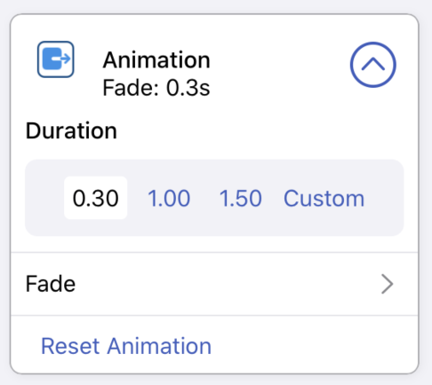
- Duration: How long should the element take to fade in. In the example 0.3 seconds
- Type: The type of animation (in the example, Fade)
Here's a table of all the possible animations for elements:
| Key | Options | Description |
|---|---|---|
| off | / | No animation |
| Fade | / | Fade in |
| Move | left / right / top / bottom | Move into the slide |
| Scale | bigger / smaller | Scale up or down into the slide |
| Fall | / | Fall into the slide from above |
And here's a short video that shows all the animations seen above:
Size
The next general attribute is the size attribute.
It allows to change the size with which the element is displayed on the slide. This works for headlines, images, even for source code or tables.
The default value is 100%. Anything smaller than 100% makes the element smaller, anything bigger than 100% makes the element bigger. Tap the + Button to increase the size of an element or the - button to decrease the size of an element.
Block Alignment
The final general attribute allows you to define the alignment of an individual block / element (such as a headline, a list, a quote, etc).
By default, this alignment is defined in the individual theme. However, you can override it per element to be either left-, center-, or right-aligned.
You can do this with the Alignment attribute in the general inspector.